Finding Colours That Complement Your Skin Tone
Choosing what to wear for your maternity experience can sometimes feel like a bigger decision than it needs to be.
With so many colours, tones and textures to choose from, it's easy to wonder what will actually complement your complexion and make you feel beautiful and comfortable.
The good news?
There are no strict rules.
Your skin tone can be a helpful starting point when choosing colours, but ultimately, the best colour is one that makes you feel like yourself.
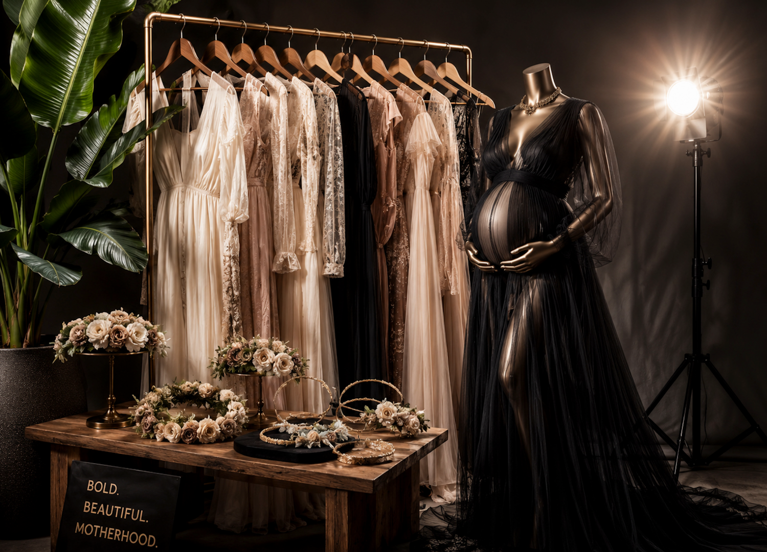
At MANAWA, my wardrobe has been carefully chosen to complement the changing shape of pregnancy, with beautiful fabrics, soft textures and tones that photograph beautifully. If you're unsure what will suit you, we'll explore the options together when you arrive.
But if you'd like a little guidance before your experience, here's where to begin.
How can you tell which undertone you have?
If you're not sure, there are a few simple ways to get an idea.
Look at your veins
- In natural light, look at the veins on the inside of your wrist.
- If they appear more blue or purple, you may lean towards cool.
- If they appear green, you may lean towards warm.
- If you see a mixture of both, you may have neutral undertones.
Try the jewellery test
Think about which jewellery you naturally reach for.
- Does silver seem to brighten your complexion? You may lean cool.
- Does gold make your skin appear warmer and more radiant? You may lean warm.
- If both look equally beautiful, you may have neutral undertones.
Look in natural light
This is perhaps the simplest test of all.
- Stand near a window without makeup and look at your skin in natural daylight.
- Does your complexion appear more rosy and pink, or more golden and warm?
And remember, this isn't an exact science. Your skin can change with the seasons, and the colours around you can influence how your complexion appears.
Cool undertones
Cool undertones often have hints of pink, rosy or blue beneath the skin.
Colours with cool or blue-based qualities can complement these tones beautifully, including:
- Soft blush pinks
- Lavender
- Icy blues
- Sapphire
- Emerald
- Deep navy
- Crisp white
- Charcoal
If you have darker hair and eyes, deeper blues, purples and jewel tones can create beautiful contrast.
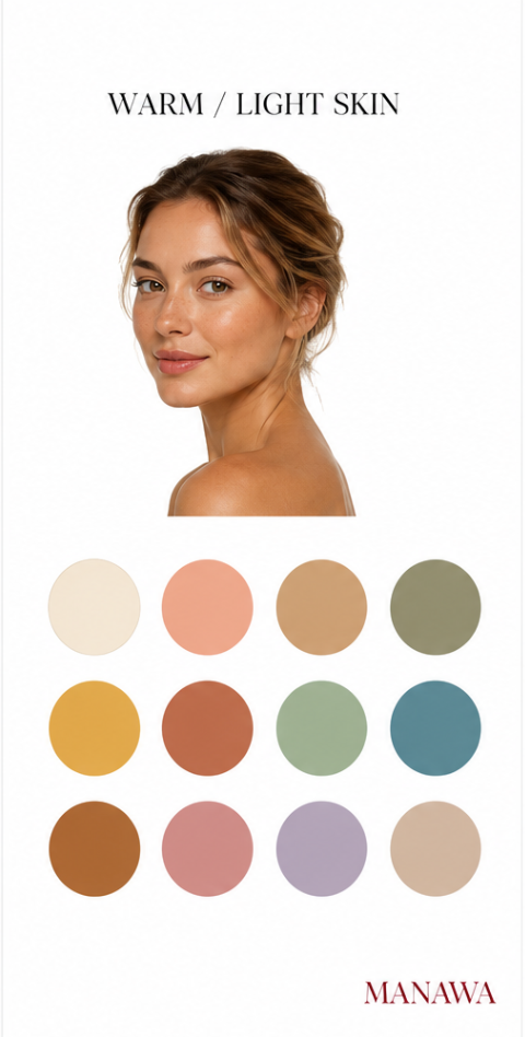
Neutral undertones
If you have a balance of warm and cool undertones, you may find that you can comfortably wear colours from both palettes.
Soft whites, taupe, greige and muted neutrals can be particularly beautiful, while both soft pastels and deeper jewel tones can work wonderfully too.
The beauty of a neutral undertone is that you have plenty of room to experiment.
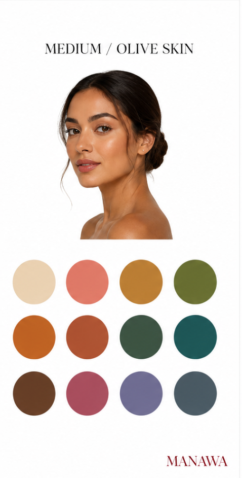
Warm undertones
Warm undertones often have golden, yellow or olive qualities.
Earthy and warmer shades can work beautifully with these complexions, including:
- Cream
- Beige
- Warm browns
- Olive
- Moss
- Terracotta
- Warm reds
- Soft oranges
- Golden yellows
If your hair has naturally warm tones, such as strawberry blonde, warm brown or golden brown, these colours can create a wonderfully harmonious look.
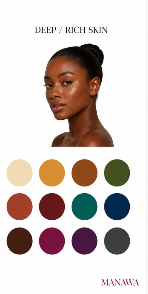
It's not just about colour
When choosing what to wear for your maternity experience, colour is only one part of the story.
Texture can completely change how a colour feels.
A soft silk catches the light differently from lace. A flowing fabric moves differently from something structured. A simple neutral can feel incredibly luxurious when paired with the right texture.
Patterns can work beautifully too, although for maternity artwork I often find that simpler pieces allow the focus to remain where it belongs — on you and this incredible stage of your life.
And if you're not quite ready for a bold colour, you don't have to wear it head-to-toe.
You can introduce colour through a delicate accessory, a soft layer or a subtle detail.
What about your partner and children?
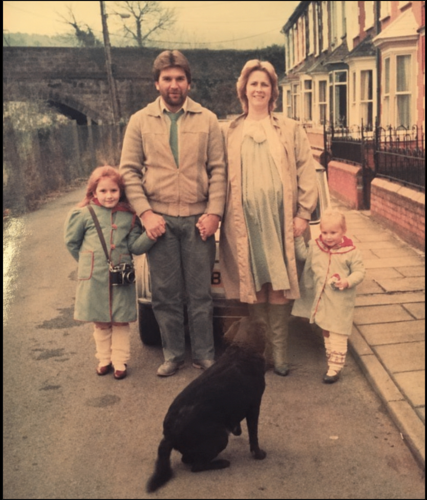
If you're bringing your family into your maternity experience, you don't need everyone dressed in matching outfits. In fact, I prefer when everyone still feels like themselves.
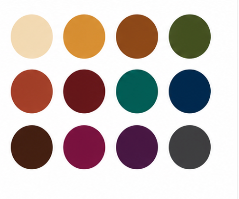
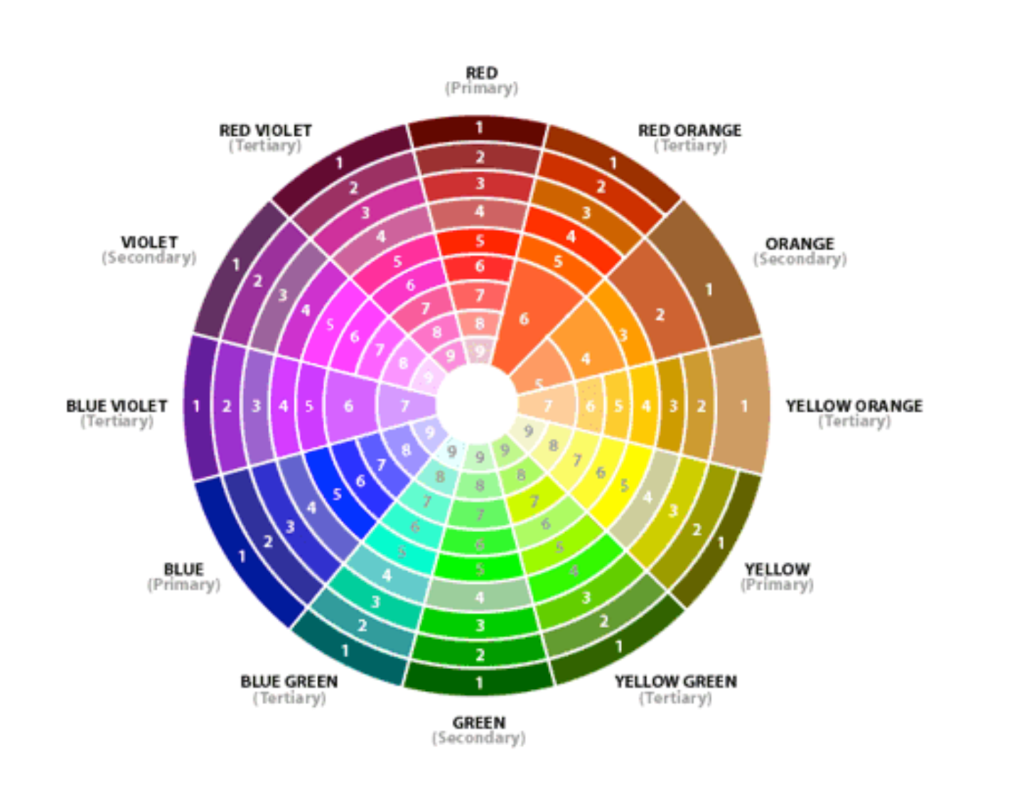
Instead, think about choosing colours that sit beautifully together. Soft neutrals, earthy tones, muted colours and gentle complementary shades can create a sense of harmony without making everyone look identical.
Below is a colour wheel to help, your looking for colours next to each other,
And perhaps the most important rule of all...
There are no rules. Your skin tone can guide you, but it shouldn't dictate what you're allowed to wear.
If you love a particular colour, wear it. If you feel beautiful in something that technically doesn't fit within your "colour palette", that matters far more than a colour chart ever could.
Take your time. Try things on. Notice what makes you feel good. And trust yourself. Because when you feel comfortable and confident, that is what shines through.
And when you come to MANAWA, you don't need to arrive knowing exactly what will work.
Bring a few pieces you love, explore the MANAWA wardrobe, and we'll find what feels right for you, your body and this chapter of your story.
The details are there to complement you —
never to take away from you.

About the Author
Emma is the photographer and founder behind MANAWA, based in Auckland, New Zealand. With over 20 years' experience photographing maternity, newborn, and family sessions, she is an award-winning photographer through the International Newborn Photography Competition and Awards (INPCA) and a regular contributing photographer for Bump, Baby & Beyond magazine. Emma's work is bold, soulful, and editorial — creating images designed to help every child feel they truly belong.